Chacalx67
Well-Known Member
I heard about people thinking "the default texture pack is good enough" or "I can't choose one, there are too many". I've never used one.
So I started editing a few blocks from the default texture pack. The first thing I've done was replacing the iron ore's color to white in order to make it more visible in caves.
And then I changed more blocks. And weapons and tools. Sometimes I just edit the brightness, sometimes I just work on a few pixels, sometimes I remake the whole block.
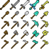
Tools and swords... wooden ones are smaller, stone ones look default, iron ones are slightly better, golden ones are beautiful, diamond ones are heavy, bigger. I've done the same with armors. The leather set makes you look like a peasant, the iron one is default, the diamond one is strong.
I've been mostly playing on brightness, visibility, reducing uglyness, and fun. This is actually a "personal augmented default".
[collapse=Screenshots, notable changes]
Note: some screenshots may be outdated.

Changed blocks. Blocks that I've made by myself or had major changes:
- Glowstone, this is a fictional block, so I guess I do what I want.
- TNT, I had the idea from another texture pack.
- Soulsand, it looks like quicksand, but remember it slows players and mobs down.
- Cake, I replaced the fruits with colorful Smarties.
- Diamond/gold/lazuli/iron/emerald block. I started editing the diamond one, I just loved it and I applied the changes to all the other blocks.
- Diamond ore, based on emerald ore. Iron ore is white. Lazuli and redstone ores are shiny.
- Mob spawner, I took the melon's side, did a 90° rotation, made it darker, added the mouth and eyes, and the borders (shades, teeth). The default mob spawner was ugly.
- Nether wart: the color changes as it grows, like wheat.

And the default texture pack for the comparison. Open the 2 screenshots in 2 tabs and see!

Mob spawner in a dungeon. Now it's a scary thing.

Swords and tools. There's really a visual difference between wood and diamond.

Zombie, pigman, creeper, enderman, cow, sheep.
I only edited 4 pixels above the zombie's eyes, he looks more cartoonish. The enderman has a new skin, new particles (I replaced the smoke particle with the potion effect one for thelulz fun), and he drops a purple ender pearl. Green pearl was irrelevant. The zombie pigman's skin was horrible, awful, shocking, inappropriate, nsfw... because his bones were visible. I replaced the bones with zombieish green skin.

Testificates!

The UI. The experience bar is divided by 10 sections instead of 18. And apples.


Pumpkin mode 1 and 2. The first one is less blurry, the second one just shows an icon in the corner.

Note: as you can see, the diamond helmet is now bigger. If you don't like it (you can't see the player's face), I've made a second image in the armors directory which has a smaller diamond helmet.

 View attachment 124092 View attachment 124091
The 2 last screenshots were made by Cheese7710. Thanks.
Also, this texture pack now supports Optifine's features. For example, textures will be rotated for certain blocks such as ores or dirt. Mobs have random skins, I've made 7 skins for zombies, and 3 for skeletons, creepers and, zombie pigmen.
[/collapse]
Dimensions: 16x16
Version: 1.5
Link to Planet Minecraft.
So I started editing a few blocks from the default texture pack. The first thing I've done was replacing the iron ore's color to white in order to make it more visible in caves.
And then I changed more blocks. And weapons and tools. Sometimes I just edit the brightness, sometimes I just work on a few pixels, sometimes I remake the whole block.
Tools and swords... wooden ones are smaller, stone ones look default, iron ones are slightly better, golden ones are beautiful, diamond ones are heavy, bigger. I've done the same with armors. The leather set makes you look like a peasant, the iron one is default, the diamond one is strong.
I've been mostly playing on brightness, visibility, reducing uglyness, and fun. This is actually a "personal augmented default".
[collapse=Screenshots, notable changes]
Note: some screenshots may be outdated.

Changed blocks. Blocks that I've made by myself or had major changes:
- Glowstone, this is a fictional block, so I guess I do what I want.
- TNT, I had the idea from another texture pack.
- Soulsand, it looks like quicksand, but remember it slows players and mobs down.
- Cake, I replaced the fruits with colorful Smarties.
- Diamond/gold/lazuli/iron/emerald block. I started editing the diamond one, I just loved it and I applied the changes to all the other blocks.
- Diamond ore, based on emerald ore. Iron ore is white. Lazuli and redstone ores are shiny.
- Mob spawner, I took the melon's side, did a 90° rotation, made it darker, added the mouth and eyes, and the borders (shades, teeth). The default mob spawner was ugly.
- Nether wart: the color changes as it grows, like wheat.

And the default texture pack for the comparison. Open the 2 screenshots in 2 tabs and see!

Mob spawner in a dungeon. Now it's a scary thing.

Swords and tools. There's really a visual difference between wood and diamond.

Zombie, pigman, creeper, enderman, cow, sheep.
I only edited 4 pixels above the zombie's eyes, he looks more cartoonish. The enderman has a new skin, new particles (I replaced the smoke particle with the potion effect one for the

Testificates!
The UI. The experience bar is divided by 10 sections instead of 18. And apples.


Pumpkin mode 1 and 2. The first one is less blurry, the second one just shows an icon in the corner.

Note: as you can see, the diamond helmet is now bigger. If you don't like it (you can't see the player's face), I've made a second image in the armors directory which has a smaller diamond helmet.

 View attachment 124092 View attachment 124091
The 2 last screenshots were made by Cheese7710. Thanks.
Also, this texture pack now supports Optifine's features. For example, textures will be rotated for certain blocks such as ores or dirt. Mobs have random skins, I've made 7 skins for zombies, and 3 for skeletons, creepers and, zombie pigmen.
[/collapse]
Dimensions: 16x16
Version: 1.5
Link to Planet Minecraft.


 your texture pack made everything look a bit smoother. It's pleasing to the eye ^-^