Install the app
How to install the app on iOS
Follow along with the video below to see how to install our site as a web app on your home screen.
Note: This feature may not be available in some browsers.
-
You're viewing the Team9000 Archives. These old threads are closed to new comments, but if something interests you or you have a question, feel free to open a new thread in the main forums.
You are using an out of date browser. It may not display this or other websites correctly.
You should upgrade or use an alternative browser.
You should upgrade or use an alternative browser.
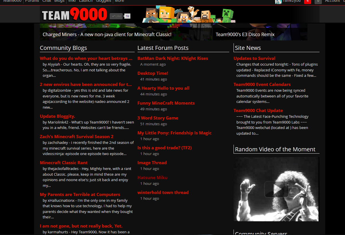
Is the front page font supposed to look like this?
- Thread starter Creeper
- Start date
Creeper
Well-Known Member
It's just the font is bugging me. It's not the same as the rest of the site.Looks like that for me as well. Only thing wrong that I can see is the player counter in the bottom right is missing.
thee_pro
Well-Known Member
Strange... I'm clicking between tabs for this page and the homepage and I see no font difference at all.It's just the font is bugging me. It's not the same as the rest of the site.
Melexiious
Well-Known Member
Yea, I noticed the font difference awhile back, actually.
It's just the font is bugging me. It's not the same as the rest of the site.
We're in the process of converting content to 'Open Sans', rather than the previous 'Trebuchet MS'.
so that's why the font seems a bit bigger on main page? also, any idea why ever since this happened, t9k logs me out when i close it?
The front page and goggles are not able to log you back in automatically at the moment. If you click forums, it should log you back in again.
kingjok3r
Well-Known Member
thanksThe front page and goggles are not able to log you back in automatically at the moment. If you click forums, it should log you back in again.

thee_pro
Well-Known Member
Also, I noticed that just clicking the login button will log you back in without having to put in your name or password.The front page and goggles are not able to log you back in automatically at the moment. If you click forums, it should log you back in again.
Well, at least it does on my phone.
Also, I noticed that just clicking the login button will log you back in without having to put in your name or password.
Well, at least it does on my phone.
The login page knows that you had "remember me" set, and acts appropriately. If only logs you back in if you have it set to remember me.
I just wanna add onto this and ask will this change back to the way it used to be cause this:
is almost a pain on the eyes.
Better? I'm not exactly the most skilled type-setter in the world. Trying to calibrate our new font selection to mix with a dark background takes some time.
rsmv2you
Well-Known Member
Yeah. Still seems a bit more bold then it usually does but better then it was.Better? I'm not exactly the most skilled type-setter in the world. Trying to calibrate our new font selection to mix with a dark background takes some time.
Yeah. Still seems a bit more bold then it usually does but better then it was.
The available weights on this font are either 300,400,600, or 700. Previously it was 400, and this is 600. There is no in between.

Melexiious
Well-Known Member
Red comic sans with underline, bold and italics with a blue background. Font size 65.
View attachment 134591
I hate you.
konflakes
Well-Known Member
I hate you.

moondoggy23
Well-Known Member
I miss the timestamp beneath the thread topics...otherwise, I kind of like the font. It has a more contemporary feel. Like we're actually cutting-edge or something.
Share: